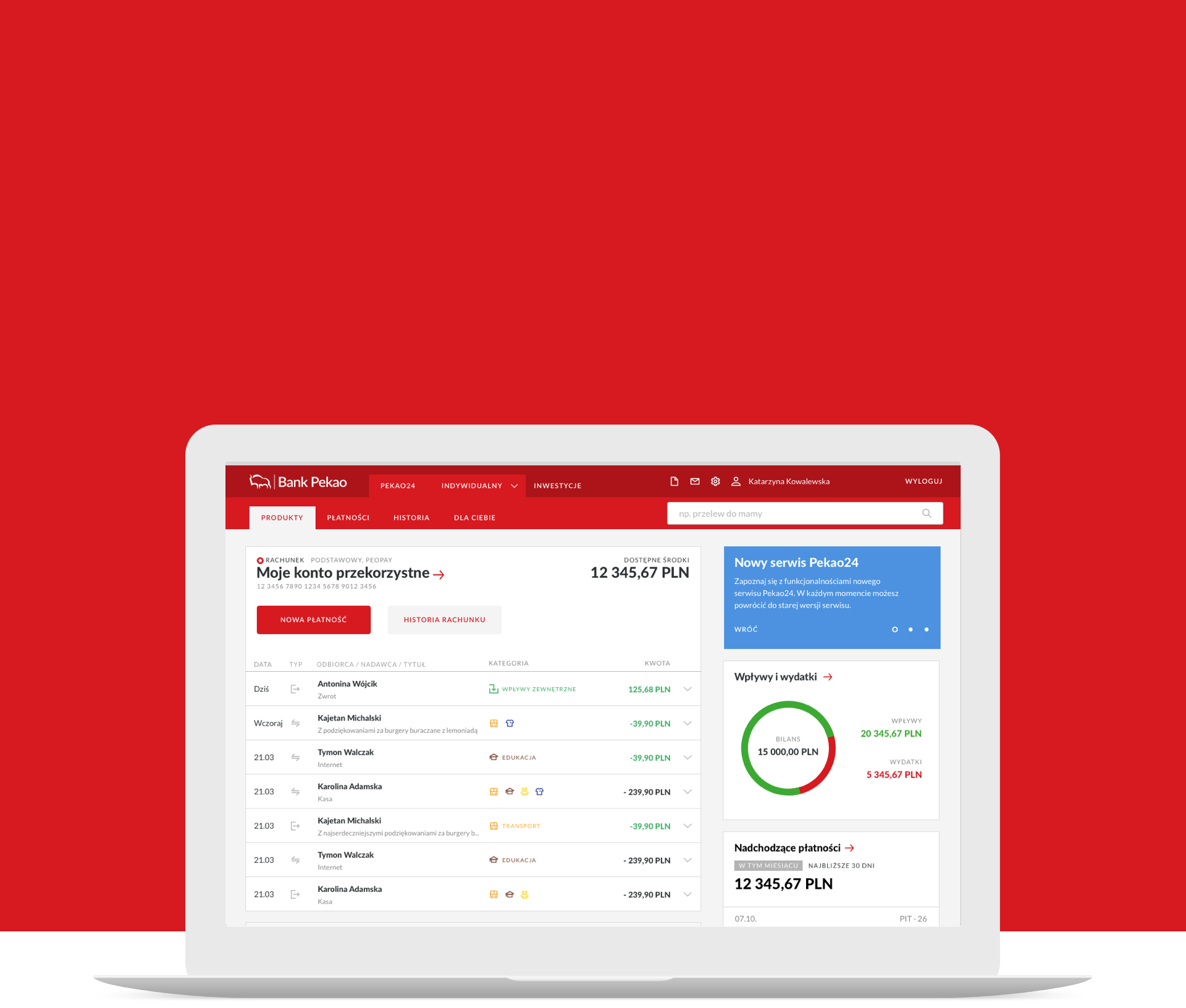
Pekao24 online banking
Challenge
Pekao Bank asked us to design a new transactional website as part of the bank’s Digital Transformation process. The bank’s existing customer service was designed in 2009, when the digital market was not yet familiar with the concept of responsiveness. Accordingly, Bank Pekao developed various mobile products in parallel – a separate mobile website, a tablet version of the application, a mobile application for individual customers and investors, and two separate brokerage services.
Such an extensive portfolio of digital products has become expensive and inefficient for the Bank to maintain. Pekao therefore decided to create an omnichannel platform that provides the same user experience no matter what device the user is using – on a computer, smartphone or in a bank branch.
Industry
Key point

User-centred design
The basic assumption while designing the new website was to implement the project with the convenience of its use in mind. Therefore, in the first stage we conducted, in cooperation with a research company, in-depth interviews with current customers of Pekao Bank and the Brokerage and analysed the problems known to the Bank reported to the customer service centre.
We have made assumptions that:
- most users have few products,
- the most common usage scenarios are the most important,
- the user progressively discovers new functions,
- we should avoid duplication of functions,
- the service needs to have a communication system with the user,
- the service should have a flat information architecture
We divided the design process itself into two stages:
- Minimum Viable Product design,
- Design of lower priority functionality.
This division allowed us to explore the design assumptions during usability testing on an interactive MVP prototype. On the basis of the conclusions we were able to introduce appropriate changes, which significantly improved the ease of use of the service and make sure that the adopted bold graphic style with a predominance of the red colour of the brand is accepted by the bank’s customers. Certain graphic elements that seemed obvious to us, the designers, turned out to adversely affect the user experience. At this stage, we tested the most important features of the service, such as the dashboard, transfer order, and search for operations in history.
How to distinguish a banking service from others on the market?
Let’s be honest, all online banking services offer similar features. What could be the unique value of such a product? What could be a significant competitive advantage? How do you create a banking service that encourages new customers to open an account?
During the concept design phase, we analysed various modern fintech applications in Poland and worldwide in terms of innovation and PSD2 implementation. We proposed to Pekao to create an omnibox – a search engine that suggests actions, information, searches all elements of the site and can answer questions.
The second competitive solution in the market is the combination of account history and transaction analysis. In the new Pekao24, users will be able to view transaction history broken down into 14 categories of income and expenditure and analyse historical data on charts.
Agile design
To optimise the costs of the Pekao24 re-design, together with the client we decided to choose an agile approach to the process. We assumed that design would take place in parallel with implementation. In practice, the K2 team designed functionality in advance of the start of a given development team sprint. This approach enabled us to verify the feasibility of projects in the context of the Bank’s technology on an ongoing basis. We also didn’t have to create clickable prototypes for usability testing, which significantly reduced the cost of our work and had a positive impact on the quick turnaround of the schedule.
We can safely say that the Agile approach to the implementation of such a large project worked perfectly and we cannot imagine the implementation of such a scale in a cascade approach (i.e. first we design everything, then we implement everything).
Style-guide
One of the major design problems was to maintain visual and functional coherence while having several designers working simultaneously. To streamline the work of front-end designers and developers, we created a style-guide for Pekao Bank’s digital products, which regulates general assumptions (e.g. grid width, colours, iconography style) and elements building the user interface (e.g. appearance of buttons and form elements). The Style-guide also helped us during the design process: by building a suitable element library in Sketch, designers could quickly create new screens from ready-made ‘building blocks’.
Advantages of the style-guide:
- saves time. Using common libraries of elements already at the stage of designing screens allows to build mock-ups faster, and designers don’t have to invent each wheel from scratch 🙂
- facilitates inter-team communication. Information management in large organisations is a major challenge. One dictionary for all helps to find a common language.
- is the basis for a real design system.
Style-guide itself is a living organism – it is impossible to anticipate all the up-front elements. As the design work progressed, we added new elements gradually and changed the appearance of the existing ones to make them work better.
