PKO Bank Polski
Challenge
How do you refresh a huge bank’s website so that it works on all mobile devices? How do you streamline the process of attracting new customers and make it easier for customers to use your website?
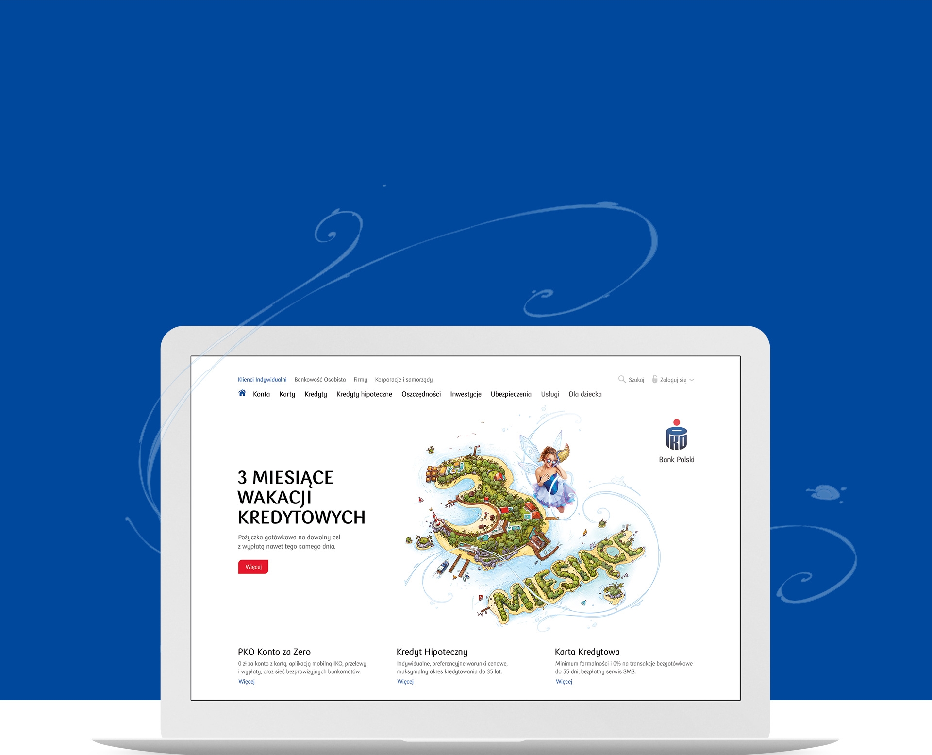
In 2016, we designed and implemented a new version of PKO Bank Polski’s main website. We designed this site for the second time, following our first implementation of this portal from 2009-2010. This time we wanted to introduce Responsive Web Design and many other improvements.
PKO Bank Polski is the largest bank in Poland, offering hundreds of financial products for many different groups of customers: individual clients, small and medium-sized companies, large corporations and institutions. The website is huge with over 15,000 pages and is visited by over 3.5 million users each month.
Industry
Key point

Solution
We have completely revamped the site navigation and introduced a new search engine to make it easier to find products. We changed the design of many pages and prepared a new graphic design. We have also made several changes to make it easier to buy products and increase the number of sales leads collected by the service. We have simplified contact with the bank and logging into transaction services.
We were responsible for the full scope of work on the website: from strategy, through design, preparation of content, implementation of the front-end and the CMS system. Finally, we optimised the portal for SEO and page load speed on various devices.
Results
The new portal resulted in a significant increase in conversions, and the number of users of the site in the mobile channel increased by 65%. In the eighth edition of the Puls Biznesu “Golden Banker” ranking, PKO Bank Polski was awarded as the most user-friendly bank in Poland for its service, mobile application and iPKO transaction system (which we also helped to design).
- 65% more mobile users
- 3.5 mln users monthly
- 2 concepts for the main portal
- 8 years of cooperation
