Building a Minimum Viable Product may be an efficient way to grow your business, but it may also result in a poor user experience. That’s why the concept of Minimum Awesome Product was introduced, to emphasis the fact that good UX is indispensable for a product to become successful.
What is an MVP?
The concept of an MVP has been in the IT industry for years now. It was made popular by lean startup methodology, proposed by Eric Ries. In a nutshell, a Minimum Viable Product is a working version of a software product, with minimum functionalities that can satisfy the needs of its first users and convince investors to invest money into it. It is by no means a mature product, rather it’s an initial version with the potential for further development.
According to the MVP approach, a software product should be released to the market as soon as its first functionalities are ready. You do not have to wait until a fully-blown product is finalized, as that might take months or even years. Time is a crucial factor here. The sooner you check your product idea with real users, the faster you gather their feedback and enhance your product accordingly. This is a build-measure-learn feedback loop—you design, code, and release your software product in iterations, and then improve its features. Conversely, if you have to fail, fail fast and avoid losing time and money, especially if the latter is not yours.
Why an MVP may not be enough
The idea of building a Minimum Viable Product revolutionized the startup world, but nowadays it is often criticized. In an MVP, the emphasis is on delivering value for customers, and possibly investors, as quickly as possible. However, it often happens that this initial value is delivered at the cost of user experience, which makes an MVP an antithesis of a good UX. The first release of a software product is crucial for its adoption or rejection, and there are plenty of examples of products that, despite all the initial hype, failed to meet user expectations (Google+, Clubhouse, Cyberpunk 2077 or foldable phones to name a few). Of course, Cyberpunk 2077 or foldable phones can still become a success if their UX is improved.
So, MVP as a product design strategy may work at the beginning, but in the long run it can lead to a poor user experience. In fact, in 2019 around 90% of startups failed. More than 50% of them failed within the first two years. One of the main reasons for startup failure was the lack of proper market research that would identify target personas, customer expectations, market demand, etc. The danger is, you end up with a great, at least according to your own opinion, product or service that nobody wants to buy.
Seeking a better MVP—build an MAP
At this point, the concept of Minimum Awesome Product (MAP for short) appears on the stage. It emphasizes the critical role of user experience when designing and building a software product. It does not mean that a Minimum Viable Product is dead. MAP is rather an MVP enhanced with great UX design.
The best way to illustrate the idea behind MAP is Aaron Walter’s hierarchy of user needs (see Figure 1). It closely resembles the hierarchy of human needs proposed by Abraham Maslov in 1940. Like Maslov’s hierarchy, Walter positions the superior needs (i.e., pleasure and delight) at the top of the pyramid. They can be achieved only when more basic needs (i.e., functionality and usability) are fulfilled.
MVP often focuses on delivering the functional, reliable, and usable elements of this pyramid, whilst neglecting the user experience. Of course, if something simply does not work, even the best UX will not convince a user to buy it. But if it does work and is reliable, this still does not necessarily mean that people will buy it. There are probably many similar products on the market, and you need to make a difference. User delight i.e., positive emotions that a user feels when interacting with your product, is often the decisive factor in solving the age old “to buy or not to buy” dilemma.
So, when building an MAP, you need to reach the top of the pyramid and create a product that is not only functional, reliable, and usable but is also pleasant to use. Ease of use, intuitiveness, a flat learning curve—you should bear all this in mind right from the beginning. What’s more, a good UX design will definitely help you improve other metrics (like customer acquisition or retention rate) that are crucial not only for your startup business, but are important for virtually every company.
How to build an MAP—our approach
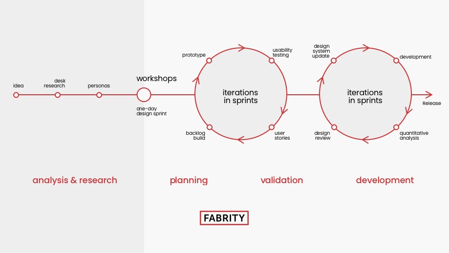
We start with an Analysis phase that includes several steps:
- Desk Research—analyze the target market and target potential users, check competitors, research reports and opinions.
- Benchmarks—analyze direct and non-direct competitors to check what has already worked or how you can evolve your product idea.
- Proto-personas—create a set of assumptions gathered from the main stakeholders and based on desk research about the possible target users of your software product; they will be verified later, at the market research phase.
- Market Research—research the target market to verify if the product is addressed to the right target group.
- Interviews with potential users—understand better what problems users need to solve; it is important to focus on pain points and user needs, not on what they want to have.
- Personas—create a target user-model based on proto-personas and market data; personas are subsequently developed further thanks to new data and feedback gathered from real users.
- Workshops (e.g., one-day design sprint)—sum up the results of the Analysis phase to make sure that we are on the same page with our client.
Then comes the Planning phase:
- Business Model Canvas—together with the client, create a strategic plan for the MAP including its value for end-users and revenue model.
- Value Proposition—define the values that your product offers to target users to solve their problems; a target user is sometimes different from your client.
- Customer Journey Map—define the way target users will interact with the product to understand better how the product will be used and thus provide a better user experience.
- Service Blueprint—build a model of an entire service provided to end-users including not only the customer journey or navigation flow but also all related processes (e.g., back office).
At Fabrity, we agree with the famous saying of IDEO, a design company: “If a picture is worth 1000 words, a prototype is worth 1000 meetings”. It emphasizes the importance of prototyping when designing a software product. Therefore, the Validation phase plays a crucial role when building a Minimum Awesome Product.
- Mockups—create low-fi and hi-fi to rapidly validate your design ideas.
- Prototypes—based on mock-ups, build a prototype (e.g., in the Axure software) with real data to analyze users’ behavior.
- Usability testing—create testing scenarios targeting users that need to take part in the testing process and based on the created prototypes.
Bear in mind that all these steps can have many iterations until our product design is final. Then it can be sent for coding. Of course, this does not mean that the UX design stage ends here. Many details are ironed out in cooperation with the development teams. The development itself is also performed in iterations according to agile methodologies. Additionally, we do extensive user testing, gather feedback, make improvements, and resolve bugs until our MAP is ready to be released to the market. Ideally, the product idea should constantly evolve to meet changing customer requirements.
Building an MAP—lessons learned
Building an MAP can be a great adventure, giving you many insights into how to design a great user experience. When I was building a healthcare chatbot, I discovered that putting the name and avatar of a doctor who helped to build it boosted conversion. When it comes to such a sensitive matter as health, people are more prone to believe a human doctor than a robot, even if the robot can help real doctors to make a correct diagnosis.
Sometimes, a tiny change can produce big results. In one of my projects, adding an SSL tag to show users that the website is secure had a very positive impact on conversion rate. If you build something new and innovative, you have to convince your users that they can trust your product.
When doing user research, it is considered good practice to divide users into smaller groups to find early adopters and innovators who are eager to try out your product. If you manage to win their hearts and minds, other users will follow them. If not, you will probably never build a true community around your product.
Last but not least, attracting users to a product is not enough. You need to retain them, which means that you should consider user experience your top priority across all project stages. Keep thinking about how to create a great user experience, for example, by creating a gamification system or even your own cryptocurrency.
Will MAP become a new MVP?
In other words, is UX worth every penny you put into it? Let’s look at some real-life examples. Apple released Magic Mouse 2 which had a charging port at the bottom. It didn’t seem like a big deal, after all, charging is a matter of minutes. But the mouse cannot be used when it is being charged, due to having the charging cable connected to its lower end. And this is what annoys users, especially in this day and age, when people want to have everything immediately. What makes this case even more emblematic is the fact that Apple is perceived as a design-centered company. So, regardless of your company’s reputation, or maybe because of it, it is definitely worth testing the usability of your product before it goes into production. And I use a Mac computer, but I prefer using a third-party mouse instead of the original one.
A second example comes from another tech giant—Google, which tried to launch its own social network platform, Google+, to compete with Facebook and Twitter. Google claimed that millions of users signed up to the platform during the first weeks after the launch, but only a few of them were actually using it. This forced Google to close it in 2018. Among the reasons why Google+ failed, we can include the lack of proper market research during the UX design to see if the potential target users would actually show an interest in the product being offered. A huge marketing and advertising campaign after the product’s release is sometimes not enough.
So, the importance of UX in a successful product launch cannot be underestimated. Moreover, if you are looking at products that managed to get through in the market, they have one thing in common: a great user experience. In fact, one dollar invested in UX can bring as much as 100 dollars in return. Additionally, developers can spend as much as 50% of their time fixing mistakes that could have been avoided by proper UX design performed in the early stages of the project.
