

A good UX design cannot go without good UX writing. When building a digital product, crafting good copy is equally important as intuitive navigation and ease of use. In this blog post, we will explain why UX writing should be an integral part of your product design process.
People expect their computer to behave in accordance with socially accepted standards.
Research by Clifford Nass, a well-known authority on human–computer interaction, shows that computer users want the computer to behave like a real person. Users are usually friendly, as if they were talking to another person. If the computer reciprocates this “respect,” the user is definitely more willing to follow instructions and trusts the computer’s messages. If the computer behaves otherwise, the user is irritated and may give up on the interaction. Since the computer can only display what it’s told to, this difference in user experience is down to good UX writing.
UX writers can help the user interact with a computer as if it were a human being
Language evolved for communication with other people. That’s why digital products will have to meet the demands and expectations of interpersonal communication in order to earn users’ trust. That is, they must be consistent and authentic when participating in dialogue.
This is not limited to chatbot conversations. Communication also means content; it means button labels or button descriptions; it means content on a product’s label; it means page headers and menu elements. In short, content communication includes the user interface. Try to imagine a product page without content: there would be nothing about the brand, the service, or the product.
Consider the following images:
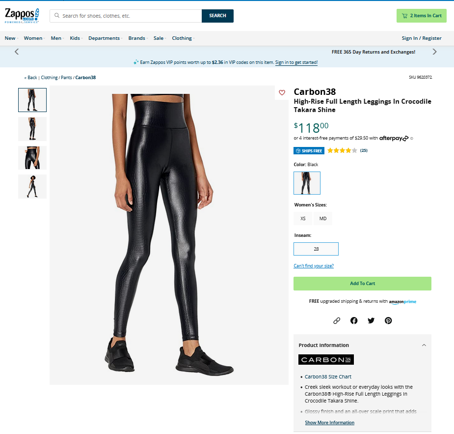
Fig. 1 Zappos product page with descriptions
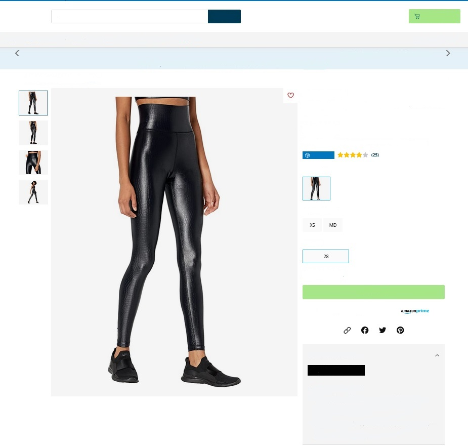
Fig. 2 Zappos product page without descriptions
These are screenshots of a Zappos product page. The screenshots differ in one detail—the content has been removed from Figure 2. From the pictures, we know that the page is about an item of clothing, specifically leggings, how they’re cut, and how they look on the model. We would be left to guess about what kind of fabric they’re made of, the size, their price, and how to actually buy this product. As it turns out, the old saying is wrong: pictures don’t paint a thousand words. Words are necessary for effective interpersonal communication. They help build a relationship with the user and also help them decide whether to buy the product.
Page content is engaging, bridging the gap between human and digital. Clifford Nass’s research shows that when the UX writing elicits positive emotions in users, they are more motivated to complete an action. The right dose of humor (with the right tone!) improves mood, increasing cooperation with the system, or even user suggestibility.
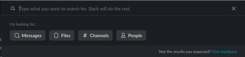
Fig. 3 Slack’s default search text is lighthearted and friendly, promising results… while the lower right corner also provides a link to the contact form in case the user is dissatisfied.
This is not to say that every label should now contain or be written as a joke. The choice, to joke or not, depends on your brand. When creating a brand, you create not only a logo and a brand book, you also create a character. A character has a personality, and a unique voice that speaks to us in print advertising and commercials, in the store, or on the helpline. Your UX writing should be consistent in creating and reflecting this character. From the landing page, through the online store, to the transaction, you (your brand) are having a conversation with the user (see Kinneret Yifrah’s book, Microcopy: The Complete Guide).
To unify the way the UX writing communicates this character to the user (the client) through every channel of contact, you’ll need to define and tailor your brand voice and tone—how formal or informal it is, how regional and/or ethnic, and its mood.
What features describe your brand to set it apart from others? Create a set of words that will help determine content design. Specify what sort of relationship you want to build with users. Partner, mentor, or friend? A seller-customer relationship or a celebrity-fan relationship?
Nielsen Norman Group identified four fundamental dimensions of tone of voice for a UX writer to choose from:
- funny vs serious
- formal vs casual
- respectful vs irreverent
- enthusiastic vs matter-of-fact
Like people, no brand is one-dimensional. No brand can be exclusively funny or strictly business—a personality is usually more colorful. We can, however, decide which end of a spectrum to be closer to.
Law firms and banks are known to choose to be more formal and businesslike in voice and tone—but that needn’t rule out enthusiasm. Energy drink brands can afford more slack and humor, but will lose customer respect by striking a humorous tone in a time of crisis. Dig down to your brand’s roots, your brand mission, to find your brand voice and tone, but especially, do your user research. It’s the users’ expectations you have to meet.
Another helpful technique is to pair your brand’s desired features with the undesirable:
- expert, but not commanding
- fun, but not silly
- confident, but not arrogant
Then think what tone you want to give your statements. It may, however, vary according to what stage the user is at (prospective customer versus long-term client) or according to the current purpose of communication. Otherwise, your brand voice in the product/service description will sound different from a contact or signup form, and different again in an error message. Here’s a useful way to consider tone of voice (or tone hierarchy) according to how deep into a website a user clicks:
Level 1
Headlines, marquee, subject lines, big story, chapter headers—tone is engaging, human, emotional, creative, thought, provoking.
Level 2
Subheads, preheaders—tone is more directional or informational.
Level 3
Main body copy, subsections, customer stories, case studies, benefits—tone is conversational, including technical details and story.
Level 4
Main bullets, deeper content, tech specs, features, capabilities—tone is technical, straightforward and to the point.
Level 5
CTA—tone is direct, short, punchy.
(Source: Michael J. Meets, Andy Welfle, Writing is Designing)
Finally, don’t forget about the nuts and bolts of language when you are evaluating your site’s consistency.
For example, how do you write your headings? On websites, title case, sentence case, and all caps are acceptable, but make your choice for the whole page.
Also, your menus should be consistent. Most commonly, the menu items are nouns or noun phrases, but you’ll want to be sure the structures of the phrases aren’t mixed up like this:
- My Favorites
- Photos
- Files
- My preferences
Menu items could also be verbs and verb phrases, but again, don’t mix them with nouns and noun phrases. If one item would be a noun phrase and the rest verb phrases, consider how to rewrite the one oddball menu item.
- Open
- Photos
- Save
- Send
“Photos” might be changed to “View” here.
Writing microcopy to communicate with the user
What is the difference between UX writing and copywriting? After all, both types of text are created for the user. The difference is that copywriters create text to bring buyers to the product; UX Writers create text for the user’s purchase process, as well as the UI text on digital products.
In a 2009 blog post, UX writer and product designer Joshua Porter described the case of a certain e-commerce project in which sales decreased by approximately 5–10% merely because the address the user had entered differed from the address associated with the user’s bank card.
When Porter added, “Be sure to enter the billing address associated with your credit card” to the purchase form, the situation was radically changed. In Porter’s words, “And just like that, the errors went away.”
In the same text, Porter introduced the term “microcopy” to refer to any UI text associated with a user’s activities. As Kinneret Yifrah clarifies in her book (Microcopy: The Complete Guide), the term means words or phrases that appear as:
- motivation toward an action
- instructions accompanying an action
- feedback after an action
So, when creating content on your website, in your app, or for your digital product, keep in mind that words should be useful. They should help people navigate the user interface and achieve what they intend to do. Useful UX writing focuses on what people expect from your product or service, or on what they can receive by performing a given action. A UX writer should not focus on how the company can benefit from the action.
For example, to encourage the user to set up an account, Zoom went beyond the standard “Sign up” on their button:

Fig. 4 Zoom sign up button
About You, a German fashion online retailer, places information on the Cart page showing when delivery can be expected, plus an estimate of related CO2 emissions. This helps to motivate purchase without being intrusive:
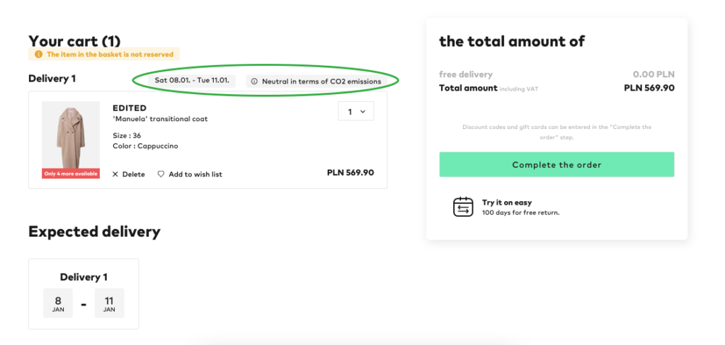
Fig. 5 A shopping cart with an estimate of related CO2 emissions
Where else should you consider your voice and tone?
- Not just the sign-up and contact forms, but also (especially) the thank you page. This is a great place to make sure your voice and tone is consistent with your landing page.
- Your 404 Error Page: Seventy-four percent of users who reach a 404 error leave your website (Impactbnd). A quick, effective, on-brand message and redirect will help keep them around.
- Any other error, especially if it comes after pressing a button. Write error state microcopy that helps users correct their errors and move to the next stage of the customer journey. It’s not enough to just apologize for the error.
An example of what not to do might be when a customer of an online bank wishes to add money to their account. If the bricks-and-mortar bank clears the transaction, but the customer gets the message “Oops! Something went wrong!” from the online bank, how can the customer know how to fix the problem? Such a message doesn’t even indicate if it was the customer who made an error, or if a software error is happening somewhere.
- Cookies. We all hate the pop-ups, so keep them polite but consistent and on-brand, and as short as possible.
- Legal texts. Of course the legal text will be more formal, but you’ll get more readers to feel positive about your service’s conditions if you write in a friendly, concise manner.
There are no words that have no effect
As Michael J. Metts and Andy Welfle write in their book Writing is Designing, your words build someone’s experience. What do you want your users to experience? How should they remember your brand, product, or page?
As a basic principle, don’t write something that you wouldn’t say out loud (Kinneret Yifrah). If the UI text doesn’t sound like something a person would say, it must be assumed that some users won’t understand it. Friendly, everyday communication doesn’t use “Fatal Error”-style impersonal phrases, and the passive voice (“password required”) is rare. The friendlier the tone and the simpler the sentences the UX writer creates, the more your site, form, app, or product will have a human face. So effective UX writing is not just for complex or difficult tasks, but also for error messages.
In their homeowners insurance form, Aviva explains “policyholder” simply and clearly:
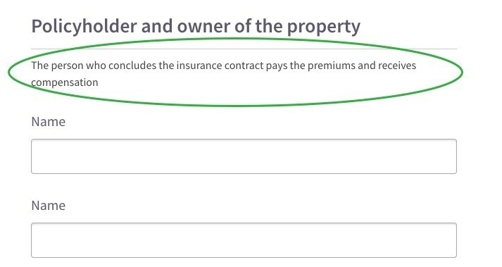
Fig. 6 Simple explanation of who a policyholder is
When searching for accommodation, a user might hesitate to go past the results page, not wanting to incur a charge. However, Booking.com clearly, and even with a certain dose of humor, puts a message under the “Reserve” button to clarify that merely clicking is free:
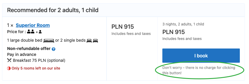
Fig. 7 Booking.com reserve button
Zalando puts a tooltip under items in the cart explaining that adding items to the basket does not reserve them for later purchase:
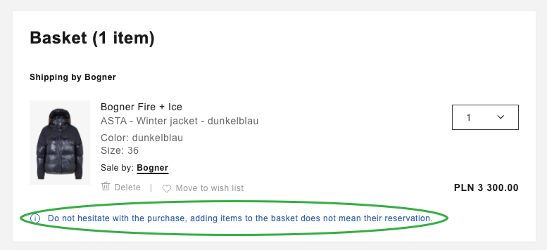
Fig. 8 Zalando’s cart view
Booking.com’s final booking form draws the user’s attention to a common mistake that can cause trouble. The default text in the email field is not the standard “Enter your email address” but rather a reminder to type carefully:
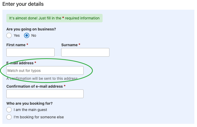
Fig. 9 Booking.com’s final booking form—entering email address
The above are also situations where some users might be concerned about privacy and security. Without useful information about how their data will be used, they may not go forward with a purchase or signup. Good microcopy can help allay the user’s concerns and build trust.
When you’re part of a UX writing team
How can you be sure your microcopy has a consistent voice and tone if your team is diverse? You’ll need to get together and decide as a team what the brand voice is and put it in a style guide. There may be some grumbling about limiting team members’ creativity. Some might enjoy the occasional chance to “switch things up.” But limits, as experts know now, actually inspire creativity.
Start simple. Clear, sharp sentences and phrases are best. Then, within the style guide, see what tweaks can be made.
Wrap-up
Why isn’t clear, simple language more common in the digital sphere? Because written language is still associated with formal modes of communication, such as legal texts and textbooks, with instructions and prohibitions, and not with conversation. But applications, forms and pages are indeed one side of a conversation. They ask, and the user answers; they give instructions, and the user follows. By adding hints at important points in a process, and by ensuring that sentences are simple and relevant, UX writers create a positive experience. Each and every label, field, and description must be seen as part of a single user path. It is very much the UX writer’s job to gain the user’s trust.