When designing a web page or app, it is vital to consider how the finished product’s digital infrastructure will facilitate customer interaction. But this isn’t all. Purely functional features only deliver part of a successful page or app. Designers should also consider the customer’s overall experience.
Not only should the customer be able to complete certain actions, the experience should also be engaging and aesthetically pleasing.
Why? This encourages user retention and time spent on a website and increases the likelihood that an app’s functional elements will elicit the desired customer behaviors.
And what is the best way to achieve this? Motion UI.
What is Motion UI?
Early static design on webpages is now being replaced by animations and transitions: things that give the impression of motion.
UI – or ‘User Interface’ – denotes all the parts of a webpage that a user can interact with, from pictures to text to animations. An efficient and pleasant UI gives a good ‘user experience’, or UX.
The combination of an effective UI and a positive UX is what creates a website or app that users will be happy to return to, and which will then provide the asset owner with desirable stats such as a high user retention rate and an increased time spent on screen.
Motion UI is a category of UI design which offers the user more than the previous static design of text and image by including simple animation and elements such as transitions, fade out, and other forms of motion.
When used logically and with a good rationale for each element, these effects can offer a more immersive experience for the user engaging with a digital product and make some functions even more effective.
Motion UI is versatile and ready to go
When animations are displayed on websites or apps, this is usually mediated through CSS, HTML5, and JavaScript. Being able to use frameworks and languages like these means that developers and designers don’t have to rely on plugins, interfaces, or video players created by third parties.
This is a significant advantage, as such third-party platforms are limited by the support offered to them by operating systems and devices. Flash is a famous example that dominated the field of online animation, but which then became obsolete when support for it was pulled, and web development moved on.
However, even simple animations can take time to make as creating using CSS elements or other code is complicated. For this reason, Mobile UI is available as a SaaS library online from Zurb Studios containing pre-written effects, CSS templates, and SASS files. A SASS file contains the basic functionality of an effect, meaning that a designer can tweak and personalise it for their own need.
These foundation components are included in Motion UI’s mixin library. Here, the developer can find a host of customizable files, meaning that businesses have control over each element of their animations and can fine-tune things such as speed and shading of colors when putting together their page’s Motion UI package.
As a result, transitions effects and UI animations are ready to go without needing third-party vendors or plugins. Businesses are then able to deliver products with an enhanced and functional user experience to the market at a greater speed than if they did not have access to pre-made effects.
Having such a standalone library of flexible UI transitions grants developers great ease when they need to create CSS animations to enhance the aesthetics and functionality of a project. The trick is knowing when to use such motion design effects and for what purpose.
What can you do with Motion UI?
Motion UI allows a designer to take advantage of movement and animation by placing them in a UI infrastructure, thereby allowing them to become core parts of the user experience. Illustrating sequences, the next step in the process, how elements can change, or eliciting specific actions are examples of what can be achieved.
The notion of a good rationale when using Motion UI is important. Animations placed without good reason and so without good design serve only to distract and irritate the user. When used carefully and with good reason, Motion UI can greatly enhance user engagement and offer several different ways of interacting with a product or brand.
UI’s purpose is to elicit certain behaviors and to provide the framework necessary for communicating certain experiences, such as anticipation or immersion in content. Motion UI provides a SASS library for creating precisely the types of effects required by a company or built-in animations to achieve specific common functions.
As mentioned, CSS animations and other Motion UI elements should only be employed when there is a good rationale. This ensures they have a function and a goal, rather than being merely decorative and therefore distracting.
Some of these animations include:
- Welcoming Users: Landing pages commonly contain a brief welcome text accompanied by an image for customers, as this creates an initial first positive impression. An animated greeting can be used in addition to the standard approach if it is justified, for example, when a page has a short loading time, an animation lasting a few seconds can keep a customer engaged.
- Enabling a Feedback Loop: When users interact with a site, they need to be kept informed as to the effect of their actions or if they are completing the necessary interactions. Examples include notifying customers of incorrect data entry into necessary fields or providing an initial sequential tutorial on app functions.
- Microinteractions: There are numerous points and clicks that take place on sites, such as opening a menu, toggling functions on or off, or swiping pages left and right and up and down. Using transition effects allows for avoiding abrupt static changes, giving a smoother experience. Buttons, switches, and drop-down menus are all examples of features which benefit from such animation.
- Giving Instructions: On static pages, multiple elements must be employed to take a customer through step-by-step instructions on completing a process or task. Good motion design, however, allows animations to take the viewer through the necessary sequential procedure, whether it’s on how to place an order or open a locker at a pick-up point.
- Representing Data: Even the most colorful chart can appear dead on a page. Motion animations allow for more dynamic data visualizations, and can also be interactive, allowing users to rotate and examine charts, tubes, and tables. Attention can also be focused on certain key parts of the data via shading and highlighting effects.
Great examples of Motion UI
As noted, some examples of Motion UI are treated more as fun elements which lack a clear purpose. The following examples show how animations and other CSS transitions can be used in a highly effective manner and still be aesthetically pleasing:
Parallax Motion for The Goonies:
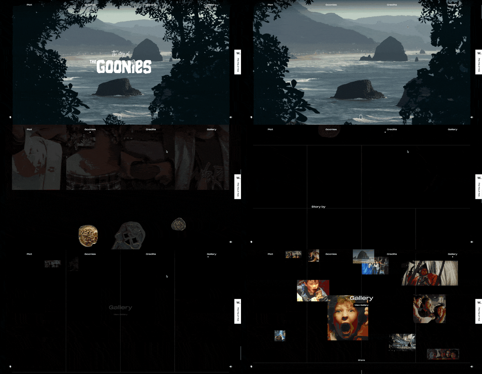
When scrolling through a page, parallax motion can be used to give the illusion of depth or 3D, enhancing the viewer’s engagement and encouraging them to stay on the page and continue interacting with the content. This tribute site to the cult 80’s movie The Goonies uses parallax motion to create an in medias res effect to draw the viewer into the movie scene and then through the different site sections. This is a great example of how motion can take the customer on a journey through page content.
Processing / Refreshing animation by Oleg Frolov:

This animation makes great use of motion to notify readers of when a page is refreshing or when other functions are being processed. Having to wait for this to happen with no visual cue that the page hasn’t just crashed is a particular nuisance. This animation reassures the customer that something is happening and keeps them informed. These are qualities which, if absent, can make engaging with the content abrupt and uncomfortable. This is a great example of how motion can improve user experience.
Google Translate:
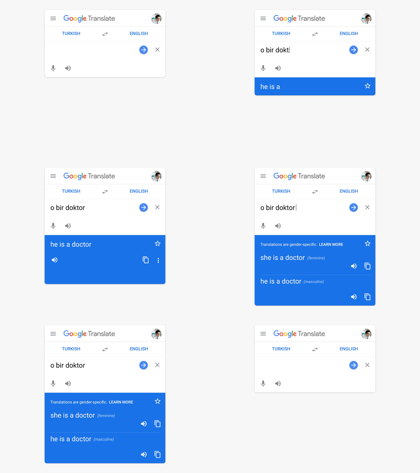
English is a relatively simple language in that there is no grammatical gender and only minimal case conjugation. Not so for many others. Previously Google would only display one possible translation of a sentence, neglecting to show how it might look in different genders or cases depending on formality and tone. Now, these alternate options are partitioned out point by point in animated blocks to inform the reader without overwhelming cognitive demand.
Summary
Motion UI is great fun, makes pages look great and gives developers a real chance to flaunt their aesthetic sensibilities and design skills. This is only a very small part of its main advantage and lies within the greater enhanced functionality that transitions and animations can offer.
Knowing exactly why motion is employed on a page increases the chances that the animation or transition effect is doing something genuinely useful and significantly improves user experience. Whether it’s helping to partition and deliver information, visualize data, or dilute the abruptness of a static page, Motion UI is a major improvement that developers can insert into their pages.
The existence of Zurb Studio’s SaaS library of UI animations, series effects, and other transitions, either pre-built or provided in basic form as an SASS file, means that their inclusion doesn’t even have to be a time-consuming project.
